#SVG to CSS Converter
Explore tagged Tumblr posts
Visit Tumblr Blog
Explore Tumblr blogs with no restrictions, modern design and the best experience.
Last Seen Tumblr Blogs


Fun Fact
The KCSC sent more than 20K requests to delete posts related to prostitution and porn to Tumblr from January to June 2017.
Text
Convert SVG to CSS
Learn how to convert SVG to CSS with this easy step-by-step guide. Optimize your web design using clean CSS from SVG code. Perfect for developers and designers.
1 note
·
View note
Text
Friends, Romans, countrymen, lend me your ears; I am fuckign coding again
Anyways I made this meme cause I found this awesome supply of old windows 98 aesthetic stuff but all the images are svg files and I Simply Do Not have the knowledge to work with those 🥲
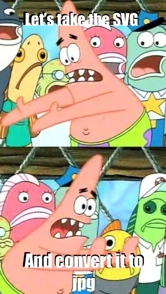
I uploaded the css to neocities and the original file is like:
background-image: svg-load(“./icon/minimize.svg”);
And I can’t figure out a way to make neocities parse that 🥺 so I’m just converting each svg file I need and uploading the teeny tiny icons thusly:
background-image: url(“minimize.jpg”);
And it worked!!! Which was so cool :D I had to download a whole entire program just to make that conversion so if anyone knows a simple way to make svgs into jpgs please let me know 😭 All of that work just to put the teeny tiny minimize icon in the minimize button. A button which I have no intention of making usable, btw 😅😅😅 it’s just for the ~aesthetic~ of it all
(Also if anyone is interested, I’m using the css from 98.css on GitHub by jdan. I’m gonna make mine like hot pink and cute though. I’ll keep y’all updated💃)
38 notes
·
View notes
Text
Pinned post
Hello tumblr! This is @ipso-faculty and I'm creating a dedicated tumblr for the flags and coinings I'm creating. This is a side-tumblr of mine and hence I'll follow back as @ipso-faculty.
I am also on Wikimedia Commons and the Fediverse.
I am intergender, demigender, intersex, disabled (POTS, long covid, AuDHD), bi/pan, ambiamorous, as well as a white settler. I mostly make intersex and disability oriented flags.
General notes - All flags I make are public domain unless noted otherwise. This means you can share and remix as you desire. No credit is needed, no permission needs to be asked. Have fun!
Design philosophy - My primary goal is to make flags that are comprehensible. I see flags as a form of communication and I like it when flags have patterns in their meanings and designs.
How to request a flag - How it works: you send me a request, I send you some prototypes, you let me know what you like or what to change, and once you're satisfied I'll post it. I'll only mention your username if I have your explicit permission to do so. - In order for me to send you prototypes, I need to be able to DM you. For my own cognitive needs, I need to be able to see a *threaded conversation*. The problem with Tumblr's ask system is if I answer your ask privately, I cannot see what I wrote. So if you reply back with "I liked flag #2" I actually don't know which flag you liked!!! - I am no longer accepting requests from users who will not let me DM them. The lack of threaded conversation via Asks is cognitively inaccessible to me. - Please only ask for flags of identities that you have (or have a legit connection to the relevant community). I want to be able to consult with you on prototypes and know that the designs I'm making are appropriate for the relevant identity group. - When asking for a flag it's helpful if you let me know if there are existing designs, symbols, or the like you'd like me aware of or to get incorporated <3 ***
Flag resources (I'll be adding links to this that I find useful, so if reblogging check the original url for the latest version) Colours - OKLCH colour picker & converter - why it's worth learning oklch - introduction to perceptual colour spaces like LCH - introduciton to what a colour space / gamut is - Wikipedia's list of flags by colour combination
Flag layouts - Wikipedia's glossary of vexillology - Wikipedia's list of flags by aspect ratio
SVG drawing - introduction to SVG - Scaling SVG with CSS - MDN documentation on SVG transform - Bézier curve tutorial - Python drawsvg documentation - Python drawsvg library
Tumblr - How to back up your tumblr
Resources/guides I've written - Different ways to style infinity symbols (and why it matters)
10 notes
·
View notes
Text
https://www.oktoolbox.com
LED Scrolling Text Led subtitle scrolling tool, suitable for playing work content, text reminders, advertising slogans, etc. on computers or mobile phones
XML Formatter The XML formatter can beautify the compressed XML code or compress the XML code
Timestamp Converter The tool can convert timestamps into date and time, and can also convert date and time into timestamps
QR Code Generator The tool can generate QR code pictures from web addresses or text, and can set the format, fault tolerance, size, color and logo of QR codes
Text Encryption and Decryption Online text encryption and decryption tools, support AES, DES, RC4, rabbit, tripledes
URL Encode and Decode You can convert a normal URL to an encoded URL or an encoded URL to a normal URL
Image Color Recognition Free online image color recognition tool, which can extract the main color of the image
Flow Chart Online flow chart tool, with built-in multiple graphics such as rectangle, circle, line, arrow and flow chart, supports exporting SVG/PNG/JPG.
Color Picker The color code, hex and RGB values can be obtained through the color selector, color table and color name
Character Counter This tool can quickly calculate the number of words, letters, numbers, punctuation and Chinese characters in the article
Morse Code Morse code encoding and decoding tools help you encode text into Morse code and decode Morse code into text
UTF-8 Encode and Decode You can convert text to UTF-8 or UTF-8 to text
Decimal Converter The online binary converter provides binary, octal, decimal, hexadecimal and other mutual conversion functions
GIF Generator You can make GIF pictures online and combine multiple static pictures into one dynamic picture
JSON Formatter The JSON formatter can beautify the compressed JSON code or compress the JSON code
Cartoon Avatar Maker Free cartoon avatar online production tool, you can freely choose the facial expression, facial features and clothing of the characters
Htpasswd Generator Generate Apache HTTP basic authentication password file online
Letter Case Converter The tool can convert uppercase letters to lowercase letters, and also convert lowercase letters to uppercase letters
SQL Formatter SQL formatter can beautify the compressed SQL code or compress the SQL code
Markdown Editor You can write markdown code and preview it in real time in the browser
Regular Expression Online regular expression testing tools can help you quickly test whether the regular expressions you write are correct
CSS Formatter CSS formatter can beautify compressed CSS code and compress CSS code
Text Deduplication This tool can automatically remove duplicate content lines in articles or text
ASCII Encode and Decode It can convert the local characters in the code into Unicode and solve the problem of garbled code encountered in programming
Port Scanner Scan common or specified ports to see if they are open
Text Compare The two texts can be compared online to detect the difference between the two texts
Image Format Converter Can modify the image format, support JPG, PNG, BMP, JPEG, GIF, SVG, webp, ICO formats
Date Calculator You can calculate the number of days between dates, and calculate the number of days from today to a certain day in the past or the future
Unicode Encode and Decode You can convert text to unicode or Unicode to text
ICO Converter You can crop pictures online and convert them into favicon.ico files
Image Character Recognition The characters in the image can be recognized online
Base64 Encode and Decode Base64 encoding and decoding tools help you encode text into Base64 and decode Base64 into text
Face Recognition It can automatically recognize the faces in the photos and cut out the head pictures in batches
Image to Base64 You can convert pictures to Base64 or Base64 to pictures
Photo Background Color You can modify the background color and size of photos online
Random Password Generator You can randomly generate a password containing numbers, uppercase letters, lowercase letters and symbols
Photo to Sketch A tool for automatically generating hand drawn style photos, which can set the blur level of hand drawn pictures
Random Number Generator One number can be generated randomly, or multiple random numbers can be generated in batch at a time
Calculator Mathematical calculation of addition, subtraction, multiplication, division, root square, PI, reciprocal, sine and cosine
Text Flow Chart A tool for drawing flow chart using ASCII code
XML to JSON The tool can convert XML to JSON or JSON to XML
Table Data Conversion A tool that can convert table data into JSON format
Mind Map You can make mind map, directory organization chart, fishbone chart, logical structure chart, organization chart online
MD5 Encryption It can convert text into MD5 and generate 32-bit and 16-bit MD5 ciphertext
Gantt Chart You can use this tool to draw Gantt Chart, which is convenient for project management and schedule management
Image compressor It can help you compress PNG/JPEG images online
Image to PDF You can combine multiple pictures of unlimited format and size into a complete PDF document
Image Watermarking The image watermarking tool can customize the text, font size, font color, transparency and text spacing
2 notes
·
View notes
Text
Why Your Website Isn’t Mobile-Friendly (And How to Fix It!)
In today's digital era, having a mobile friendly website is no longer optional; it's a necessity. If your website isn't optimized for mobile devices, you're losing traffic, frustrating users, and hurting your search engine rankings. But why exactly is your website not mobile-friendly, and how can you fix it? Let's dive into the key reasons and solutions.
Why Mobile Friendliness Matters
A mobile friendly website ensures a seamless user experience across different devices, improves SEO rankings, and boosts engagement. With over 60% of web traffic coming from mobile users, businesses that ignore mobile optimization risk falling behind.
Signs Your Website Isn’t Mobile-Friendly
Users must zoom in or scroll horizontally to read content.
Slow loading times on mobile devices.
Unresponsive design elements.
Buttons and links are too small or too close together.
Poor navigation leading to high bounce rates.
Reasons Why Your Website Isn’t Mobile-Friendly
1. Your Website Lacks a Responsive Design
A responsive website automatically adjusts its layout based on the screen size. If your site isn't using a responsive design, mobile users will struggle with distorted images and unreadable text.
Solution: Opt for a Website Designing approach that includes responsive design frameworks like Bootstrap or CSS media queries.
2. Slow Page Loading Speed
Mobile users expect pages to load within 3 seconds. If your site is slow, visitors will leave before it even loads.
How to Fix It:
Compress images without losing quality.
Use browser caching to speed up repeat visits.
Optimize code and remove unnecessary plugins.
Enable lazy loading for images and videos.
3. Poor Navigation Structure
A cluttered menu and unorganized navigation make it difficult for mobile users to browse your site.
Solution:
Implement a mobile-first navigation design.
Use a hamburger menu for easy access.
Keep the number of menu items minimal.
4. Touch Elements Are Too Small
If buttons and links are too tiny or too close together, users may struggle to click them accurately.
How to Fix It:
Increase the button size to at least 48px by 48px.
Ensure proper spacing between clickable elements.
5. Flash and Non-Mobile Compatible Elements
Flash-based content doesn’t work on most mobile browsers, making your site inaccessible.
Solution:
Replace Flash with HTML5 or JavaScript.
Use mobile-friendly formats like SVG for animations.
6. Intrusive Pop-Ups and Ads
Full-screen pop-ups or excessive ads ruin the mobile experience and increase bounce rates.
How to Fix It:
Use smaller, non-intrusive pop-ups.
Provide a clear and visible exit option.
Ensure ads do not cover essential content.
7. Not Using Accelerated Mobile Pages (AMP)
AMP helps pages load instantly on mobile, enhancing user experience and improving rankings.
Solution: Implement AMP for your website to improve speed and engagement.
How to Make the Website Mobile Friendly
If you're wondering how to make the website mobile friendly, follow these best practices:
Use a Responsive Website Design: Ensure your website adapts to different screen sizes effortlessly.
Optimize Images and Content: Compress images and use readable fonts.
Improve Page Speed: Leverage caching, CDN, and optimized code.
Ensure Easy Navigation: Keep the layout intuitive and user-friendly.
Test Across Devices: Regularly test your website using Google’s Mobile-Friendly Test.
Need a Mobile-Friendly Website? We Can Help!
At Arrowpace, we specialize in Website Design Services that ensure your website is not only visually appealing but also optimized for mobile users. Whether you need a redesign or a brand-new mobile-friendly site, our website design and development services have you covered.
Get a High-Performing Mobile-Friendly Website Today!
Partner with Arrowpace to transform your website into a mobile-optimized, high-converting powerhouse. Contact us now to get started!
0 notes
Text
Games Production (Feb 5th)
An Overview
This week was about consolidating everything I did last week, getting the assets I was waiting for, and improving Star In The Making (the game) and Workflow Toolkit (the Unity Plugin/Tool Project).
Star In The Making
The person I'm commissioning finally managed to get back to me - and gave me the songs; I had to ask a friend who knows a lot about mixing to touch up one or two of the songs to ensure all of the volumes matched, as one of them was louder than the rest. I now have 4 out of the 5 total songs for this project (and OST I will release on SoundCloud, Bandcamp and Spotify as a part of my Post-Production Module)
The tracklist is supposed to tell a story for this game.
Here are all of the songs! Feel free to listen to them (and give your feedback!)
Tracklist (could be changed):
Celestial Prelude
Star In The Making
Into The void
VOID (Cosmic Echoes?)
I am very proud of this so far. The final song hasn't been commissioned yet, but will be the star leaving the void, and entering a new world.
Balance Changes
I made some balance changes for Star In The Making as I felt the game took too long.
Normalisation Factor: 12,500 -> 10,000 (leading to faster games)
Difficulty Factor: 0.55 -> 0.65 (black holes grow more with less points)
Minimum Pull Radius: 0.5 -> 0.6 (black holes start with a little bit of power)
Here's a visual difference in growth - measuring from 0 points to 500.
Before

After

More features to come, like my planned pick-ups.
Workflow Toolkit
I managed to get all translations for English, Spanish and Dutch, and consolidated them all on my Localisation Sheet - a good way to express this data (and I will be able to script and auto-export in the future)

These have been added to the toolkit itself and are now fully compatible with these three languages.
I managed to talk to my cousin (who is Portuguese), and she thankfully agreed to translate these strings into Portuguese (EU); I will have to wait for week three to get all of them, though.
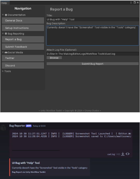
I also fixed one or two issues with the Workflow Toolkit (UI bugs regarding localisation).
Due to security concerns, I also reworked the previous "BUG REPORTING" and "FEEDBACK" pages for the Workflow Toolkit; I felt that having discord hard-coded webhooks in your project is unsafe and looks unprofessional. I opted to have a Google Sheets feedback page for both.
Before

After


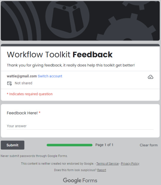
Unfortunately, I lost the ability to upload log files, but I feel like this is far more professional.
Note, This modification was started during the last week of last semester, but I have fully finished it here.
Website
I also fixed countless issues with the website for both mobile and PC viewing - here's a before (left) and after (right):


I also converted the base64 encoded SVG background and put it as an actual file, which greatly optimises the project.


I also removed some unused CSS.
Some other improvements were backend optimisation for both the website and the project.
QuickBlock
I used Rider's built-in tools to refactor and re-format the code; I did not do much else on this project this week due to focusing on wrapping up the other two projects.
================================================
Performance Evaluation
[ I consolidated last week's work very nicely, getting integral assets created and polished (mixing and mastering for songs). I am quite proud of this, as I have something to listen to and share with the world.
I am also proud with my improvements to the website, The changes I made won't bring new people, or be stunning for the user, but the optimised website allows it to just run faster, and more efficiently - making them more professional. ]
[ I can tell that I am struggling with project prioritisation, QuickBlock has been taking a backseat for a while, which does indicate that next week, I need to push the project further, even if it is just a tiny bit, as I don't want this project to be sidelined, and my focus diluted. ]
I am happy with this week's work overall though, I pushed Workflow Toolkit quite far with the improvements, and Star In The Making's soundtrack will open up some new doors (like potentially putting these songs on Spotify, Soundcloud and/or Bandcamp)
================================================
Action Plan
Next week, I need to focus on bringing up QuickBlock to a respectable place, even if I don't do much on the project, something needs to be done, and ideas that were discussed in the Game Design Document will need to be planned and researched as I don't want this project falling even further than it already is.
I need to also continue refining the website's UI to something I'm happy with, potentially adding a custom .404 error page to make sure users are able to navigate back to the website if they type something wrong.
GitHub Pages (the hoster I'm using) has it's own .404 error page, but it is quite "boring".

I will also ensure that if signs of burnout appear, I will sort them out first, by diverting attention from hard, important tasks, to less critical, but more "fun" tasks.
================================================
0 notes
Text
Can you convert Adobe XD to HTML?
Yes, you can convert Adobe XD to HTML, but the process involves multiple steps. Adobe XD is a design tool used to create user interfaces and prototypes, while HTML is the coding language used to build websites. To convert XD designs into a functional HTML website, you generally need to:
Export Assets: Extract images, icons, and other elements from the Adobe XD file. Adobe XD allows you to export these as PNG, SVG, or JPG formats.
Write HTML & CSS: You'll need to manually code the structure of the website in HTML and style it using CSS to match the design created in Adobe XD. This also involves making the site responsive for different devices and screen sizes.
Add JavaScript (Optional): If your design includes dynamic elements like sliders or forms, you’ll need to use JavaScript to bring these functionalities to life.
However, manually converting XD designs to HTML can be time-consuming and requires a good understanding of coding. That's where services like Figma2HTML come in. Although named for Figma, Figma2HTML also specializes in converting Adobe XD designs into clean, responsive HTML/CSS code.
With Figma2HTML, you can hand off your XD design to a team of experts, who will transform it into pixel-perfect HTML, CSS, and JavaScript. This service can save you both time and effort, ensuring your website is fully functional and professionally coded without you needing to dive into the technical details.
If you're looking for an efficient and high-quality solution, check out Figma2HTML to streamline your design-to-development process!

0 notes
Text
What Are the Benefits of Using Vector Art?
Vector art offers several significant benefits, making it a preferred choice for various design applications. Here are the primary advantages:
Scalability
One of the most notable benefits of vector art is its scalability. Vector graphics are created using mathematical equations, allowing them to be resized indefinitely without losing quality. This is crucial for projects that require different sizes of the same image, such as logos, which need to look sharp on business cards and billboards alike.
File Size Efficiency
Vector files are typically smaller than raster files, especially when dealing with complex images. This is because vectors store information as mathematical formulas rather than pixel data, leading to more efficient storage and easier sharing.
Editability
Vector art is highly editable. Designers can easily modify individual elements, such as shapes, colors, and lines, without affecting the rest of the artwork. This flexibility is particularly useful during the design process, where changes are often necessary.
Resolution Independence
Unlike raster graphics, which can become pixelated when zoomed in, vector graphics maintain their crispness and clarity at any resolution. This makes vector art ideal for high-resolution prints and digital displays.
Versatility
Vector art is versatile across various media and applications. It is compatible with numerous design software programs like Adobe Illustrator, CorelDRAW, and Inkscape. This versatility extends to different industries, including advertising, web design, animation, and product packaging.
Precision and Detail
Vector graphics offer precise control over shapes and lines, enabling the creation of detailed and intricate designs. This precision is essential for technical illustrations, typography, and other areas where exact measurements are critical.
Easy to Convert
Vectors can be easily converted to raster images when necessary, but the reverse process is much more complex. This flexibility allows designers to use vector graphics as a starting point and export them in various formats for different uses.
Consistency
Vector art ensures consistency across different platforms and media. The mathematical nature of vector graphics means that colors, shapes, and sizes remain consistent regardless of where and how the image is used, ensuring a unified brand appearance.
Resource Efficiency
Working with vector graphics can be less demanding on computer resources compared to high-resolution raster images. This efficiency can lead to smoother performance in design software, especially when dealing with large files or complex projects.
Interactivity and Animation
Vector graphics are well-suited for interactive and animated applications. They are commonly used in SVG (Scalable Vector Graphics) format for web animations, which are lightweight and easily manipulated with CSS and JavaScript.
Print Quality
For printed materials, vector graphics offer superior print quality. They can be output at the highest resolution the printer can handle, ensuring that the final printed piece is as sharp and clean as possible.
Conclusion
In summary, vector art provides unparalleled flexibility, efficiency, and quality, making it an essential tool for modern designers. Its scalability, editability, and resolution independence ensure that designs look professional and consistent across all platforms and applications. Whether for print or digital media, vector graphics are a powerful asset in any designer's toolkit. By leveraging the unique benefits of vector art, designers can achieve precise, versatile, and visually appealing results that stand the test of time
1 note
·
View note
Text
Figma to HTML Conversion: Simple Guide To Convert Figma To HTML
Introduction: In the modern web development landscape, designers and developers often collaborate using tools that bridge the gap between design and code. Figma, a popular design tool, is widely used for creating stunning web interfaces. However, turning those designs into functional websites requires converting Figma to HTML. This process might seem complex, but with the right approach, you can efficiently convert Figma to HTML, ensuring that your designs come to life on the web.
Why Convert Figma to HTML? Figma is an excellent tool for crafting visual designs, but to bring those designs to the web, you need HTML, CSS, and JavaScript. Converting Figma to HTML allows you to take a static design and transform it into a responsive, interactive website. This conversion is essential whether you're creating a standalone website or integrating your design into a content management system like WordPress.
Step-by-Step Guide to Convert Figma to HTML:
Prepare Your Figma Design Before diving into the conversion, ensure your Figma design is well-organized. Use consistent naming conventions for layers, group similar elements, and double-check that your design is pixel-perfect. This preparation will make the conversion process smoother and more efficient.
Export Figma Assets The first step in Figma to HTML conversion is exporting the necessary assets. Figma allows you to export images, icons, and other elements in various formats such as PNG, SVG, or JPG. Select the elements you want to export, right-click, and choose the export option. These assets will be used in your HTML and CSS files.
Convert Figma to HTML/CSS
Manual Coding: Start by setting up a basic HTML structure using semantic elements like <header>, <section>, and <footer>. Write CSS to style these elements according to the design specifications in Figma. Pay attention to typography, color schemes, and spacing.
Using Figma Plugins: There are Figma plugins like "Figma to Code" that can help automate parts of the conversion. These plugins generate HTML and CSS code based on your design. While not perfect, they can significantly speed up the process and provide a good starting point for further customization.
Responsive Design Ensure your converted design is responsive. Use media queries in your CSS to adjust the layout for different screen sizes. Figma allows you to design for multiple screen resolutions, and your HTML/CSS should reflect this adaptability.
Integrate with WordPress (Optional) If you're working on a WordPress project, you can convert Figma to WordPress by creating custom templates. Export your Figma design elements, then integrate them into a WordPress theme using PHP. This step requires a bit more technical knowledge, but it allows for seamless content management and dynamic features.
Test and Optimize After converting Figma to HTML, thoroughly test your website across different browsers and devices. Optimize images and code to ensure fast loading times. Validation tools can help you check for any HTML or CSS errors that might affect the user experience.
Conclusion Converting Figma to HTML is a crucial step in turning your design ideas into a functional website. Whether you choose to manually code or leverage tools and plugins, following a structured approach will help you achieve a pixel-perfect result. As web design continues to evolve, mastering the Figma to HTML conversion process will enhance your ability to create responsive, interactive, and visually appealing websites.
#Figma to HTML#Convert Figma to HTML#Export Figma to HTML#Figma to HTML Conversion#Figma to Code#Figma to Wordpress#Figma to HTML Conversion Services
0 notes
Text
Transforming Designs: How to Convert Figma to WordPress Effectively
In the dynamic world of web development, transforming a meticulously crafted design into a functional website is both an art and a science. Figma, a robust design tool, is increasingly becoming the go-to for web designers due to its collaborative features and versatility. However, converting Figma designs into a WordPress site can be a daunting task if you're not well-versed in the process. This blog aims to demystify the conversion process and provide a clear roadmap for developers and designers alike.

Why Choose WordPress for Your Website?
Before diving into the conversion process, it’s essential to understand why WordPress is the platform of choice for many developers. WordPress powers over 40% of all websites on the internet, thanks to its flexibility, scalability, and user-friendly interface. Custom WordPress development allows for the creation of unique, feature-rich websites that cater to specific business needs.
Benefits of Converting Figma Designs to WordPress
Visual Precision: Figma’s vector-based design system ensures that your website looks exactly as you envisioned it.
Collaboration: Figma’s collaborative tools allow designers and developers to work together seamlessly, ensuring that the final product aligns with the initial design.
Efficiency: Converting designs from Figma to WordPress can streamline the development process, saving time and reducing errors.
Step-by-Step Guide to Convert Figma to WordPress
Step 1: Prepare Your Figma Design
Organize Layers: Ensure that your Figma design is well-organized with named layers and groups. This will make the development process smoother.
Responsive Design: Check that your design is responsive, meaning it will look good on various devices and screen sizes.
Step 2: Export Assets from Figma
Images and Icons: Export all images, icons, and other graphical elements from Figma. Ensure they are in the correct formats (e.g., PNG, SVG) and resolutions.
CSS and Styles: Use Figma’s built-in tools to extract CSS styles for text, buttons, and other elements.
Step 3: Set Up Your WordPress Environment
Local Development Environment: Set up a local development environment using tools like XAMPP, WAMP, or Local by Flywheel.
Install WordPress: Download and install the latest version of WordPress on your local environment.
Step 4: Develop the WordPress Theme
HTML and CSS: Create HTML and CSS files based on your Figma design. Start with a basic HTML structure and gradually add styles.
Theme Structure: Follow the WordPress theme hierarchy to create essential files like header.php, footer.php, index.php, style.css, and functions.php.
Template Files: Use WordPress template files to define different parts of your site, such as the homepage, single posts, and pages.
Step 5: Implement Functionality
Custom Post Types: Define custom post types in functions.php if your site requires specific content types.
Advanced Custom Fields (ACF): Use the ACF plugin to create custom fields and add more flexibility to your content management.
Plugins: Install necessary plugins to add functionality like SEO, security, and performance optimization.
Step 6: Test and Optimize
Cross-Browser Testing: Ensure your site works well across different browsers and devices.
Performance Optimization: Optimize images, minify CSS and JavaScript files, and leverage caching to improve site performance.
SEO: Implement SEO best practices, including meta tags, alt texts for images, and a clean URL structure.
Common Challenges and Solutions
Responsive Design Issues: Use media queries in CSS to ensure that your site looks good on all devices.
Alignment and Spacing: Pay close attention to the spacing and alignment of elements to ensure they match your Figma design.
Complex Animations: Use CSS and JavaScript libraries like Animate.css or GSAP to recreate complex animations.
Tools and Plugins to Facilitate the Conversion
Figma to HTML Tools: Tools like Anima or Figma2HTML can automate parts of the conversion process.
WordPress Page Builders: Elementor or Beaver Builder can help you build complex layouts without extensive coding.
Theme Frameworks: Use frameworks like Genesis or Underscores to speed up theme development.
Conclusion
Converting Figma designs to WordPress involves a combination of design precision and coding expertise. By following the steps outlined above, you can ensure a smooth and efficient conversion process, resulting in a stunning, fully functional WordPress website. Whether you’re a designer looking to bring your vision to life or a developer aiming to streamline your workflow, mastering the Figma to WordPress conversion process is an invaluable skill in the realm of custom WordPress development.
0 notes
Text
JPG to SVG Converter: Unlocking the Power of Scalable Graphics
In the digital age, visual content reigns supreme. Whether you're a graphic designer, web developer, or simply someone who values high-quality visuals, converting JPG images to SVG (Scalable Vector Graphics) format can significantly enhance your projects. Let's delve into the features and benefits of using a JPG to SVG converter, along with a simple guide on how to utilise this powerful tool.
Key Features of JPG to SVG Converter
1. High-Resolution Output
One of the standout features of a top-tier JPG to SVG converter is its ability to produce high-resolution output. Unlike raster images (JPG), SVGs are vector-based, ensuring your graphics remain crisp and clear at any scale. This is crucial for maintaining the quality of logos, icons, and other graphics across different devices and screen sizes.
2. Simple Interface
Ease of use is paramount when it comes to software. The best JPG to SVG converters boast a user-friendly interface, allowing even beginners to navigate and convert files effortlessly. With intuitive controls and clear instructions, you can focus on your creativity rather than grappling with complex software.
3. Batch Processing
Efficiency is key in any workflow. Batch processing allows you to convert multiple JPG files to SVG format simultaneously, saving you valuable time. This feature is particularly beneficial for professionals handling large volumes of images, enabling them to streamline their processes without compromising on quality.
4. Speed and Efficiency
Time is of the essence in any project. A high-quality JPG to SVG converter delivers rapid conversions without sacrificing performance. By optimising the conversion process, these tools ensure you can swiftly move from one task to the next, enhancing overall productivity.
5. Device Compatibility
In today’s multi-device world, compatibility is crucial. Leading converters ensure your SVG files are compatible across various devices and platforms. Whether you’re working on a desktop, tablet, or smartphone, you can seamlessly convert and access your files anytime, anywhere.
Benefits of Using JPG to SVG Converter
1. Scalability
SVG files are inherently scalable, meaning they can be resized to any dimension without losing quality. This is particularly advantageous for web graphics, as it ensures images look sharp on all devices, from high-resolution monitors to mobile screens.
2. Editability
Unlike JPGs, SVG files are easily editable. You can tweak elements, change colours, and adjust shapes without degrading the image quality. This flexibility is invaluable for designers who need to make frequent adjustments to their graphics.
3. Performance
SVGs are lightweight and load faster than their raster counterparts. This improves website performance, enhancing user experience and potentially boosting SEO rankings. Faster loading times can reduce bounce rates and keep visitors engaged with your content.
4. Versatility
SVGs are versatile and can be used across various applications, including web design, print media, and interactive graphics. Their compatibility with CSS and JavaScript also allows for dynamic and responsive designs, opening up a world of creative possibilities.
How to Use the JPG to SVG Converter
1. Upload Your Files
Begin by uploading the JPG files you wish to convert. Most converters allow you to drag and drop your files into the interface or select them from your device. With batch processing, you can upload multiple files at once, making the process quick and efficient.
2. Adjust Settings
Once your files are uploaded, adjust the settings to suit your needs. You can customise options such as colour depth, transparency, and image resolution. Some converters also offer advanced settings for optimising the conversion process, ensuring the best possible output.
3. Download Your SVGs
After adjusting the settings, initiate the conversion process. The converter will swiftly transform your JPGs into SVG files. Once the conversion is complete, you can download your new SVG files directly to your device. These files are now ready for use in your projects, offering unparalleled scalability, editability, and performance.
Conclusion
A JPG to SVG converter is an indispensable tool for anyone seeking to enhance their digital graphics. With features like high-resolution output, a simple interface, batch processing, and device compatibility, these converters streamline your workflow and improve the quality of your visuals. The benefits of scalability, editability, performance, and versatility further underscore the value of SVGs in modern design. By following the simple steps of uploading your files, adjusting settings, and downloading your SVGs, you can easily harness the power of scalable vector graphics to elevate your projects to new heights.
0 notes
Text
Image SEO: Tips to Optimise Images for Users & Search Engines
Are your website's images doing more harm than good? With visual content playing a crucial role in digital engagement, neglecting image SEO is like leaving money on the table. Poorly optimised images can slow down your site, frustrate users, and cause you to slip down search engine rankings. So, in this comprehensive guide, we will unravel the secrets of Image SEO in Melbourne. These actionable tips will make your images work for both users and search engines.

Let's transform your visuals from a liability into a strategic asset! 1. Select or Create Valuable Images
The initial step in optimising your images for SEO in Melbourne is to choose or create visuals that align with your objectives. For instance:
Photos can highlight products and make text-heavy sections more engaging.
Graphic designs can illustrate abstract concepts.
Charts and graphs can present complex data clearly.
Icons can enhance website navigation and user experience.
Logos can reinforce your brand identity.
Screenshots can offer clear guidance and examples.
Whenever possible, create your own images to provide unique value to users and give Google more reasons to rank your content. If you use images made by others, ensure you have the necessary permissions to avoid copyright infringement. 2. Select the Appropriate Image Formats
Various formats are available for saving or converting image files, and each type has a different impact on your SEO in Melbourne. SVG: Ideal for icons and logos, SVGs can be resized without losing quality and can be manipulated with JavaScript or CSS. WebP: Excellent for other image types because:
It is supported by major search engines, browsers, and social media platforms (though not by some older systems).
It generally produces smaller, faster-loading files compared to other formats.
It supports transparency and animation.
It uses both lossy and lossless compression, offering a good balance between file size and quality.
Despite their advantages, SVG and WebP formats can be more challenging to create and manage.
The best alternatives include:
JPEG: For standard images.
PNG: For images requiring transparency, text, or high detail.
GIF: For simple animations.
3. Assign Descriptive File Names to Your Images
Google relies on image file names to interpret the content of the images, so it's important to use descriptive yet concise names. For example: Correct method — apple-iphone-15-pink-side-view.jpg Wrong method — IMG00353.jpg Another wrong method — apple-iphone-15-latest-model-vibrant-pink-color-side-angle-view-showcasing-camera-lens-and-buttons-2024-release.jpg Remember to avoid using spaces in file names, as Google recommends using hyphens to separate words. Plus, if you use the same image for different language versions of your content, update the file name to match the language. For instance, on your Spanish site, the file name could be iphone-apple-15-rosa-vista-lateral.jpg. 4. Include Descriptive Alt Text
Alt text is a textual description of an image stored in the web page’s code, specifically within the alt attribute of the image tag. It is primarily used for accessibility purposes, enabling text-to-speech tools to describe images to visually impaired users. It also appears when a page fails to load properly. However, alt text also plays a crucial role in your image SEO in Melbourne, as search engines use it to understand the image content better. Best practices for alt text include:
Write alt text only for functional images, not decorative ones, to avoid unnecessary disruptions for users with assistive technologies.
Describe the image in context. Use different alt texts for the same image if it's used to illustrate different points.
Keep alt text to a maximum of 125 characters, as some assistive technologies stop reading after this length.
Include critical information in the body content or image caption rather than in the alt text to ensure all users can access it.
Avoid redundant phrases like “image of” or “photo of,” as it's clear the alt text pertains to an image.
5. Resize Images
Typically, website images shouldn’t exceed 2,500 pixels in width. If your images are more than this level, consider reducing their dimensions to help decrease loading times without compromising quality. However, the optimal size depends on:
Container’s maximum width: Ensure the image size doesn't exceed the maximum width of the container it’s placed in.
Image’s purpose: Large product photos might be necessary for detailed viewing, whereas thumbnails can be much smaller.
Audience’s devices: Use Google Analytics 4 to determine your visitors' screen resolutions and adjust image sizes accordingly.
Image editing tools like Photoshop make resizing easy, or you can use plugins, such as Resize Image After Upload for WordPress, to automate the process. 6. Enable Browser Caching
Browser caching allows a visitor’s browser to store certain files, like images, for a predetermined time, so they can load faster if requested again. For example, if a new user visits your homepage and your site logo is cached for 365 days, the logo will load quickly when the user navigates to another page on your site or revisits your site within the year. Without caching, the browser has to redownload the image every time, using more bandwidth and increasing server requests. Images can typically be cached for long periods since they are seldom updated. To check if your images are cached for an appropriate duration, use Google Lighthouse. Install the Chrome extension and select the Lighthouse Viewer option to analyse a webpage. Get Expert SEO in Melbourne:
Optimising your images for SEO is crucial for improving site speed, user experience, and search engine rankings. However, a professional SEO in Melbourne can implement more strategies depending on your website. So, reach out to Make My Website if you haven’t hired an expert yet. MMW is the best web design company in Melbourne at the moment, and its SEO is equally top-notch. Book a consultation with their experts and share your concerns.
0 notes
Text
Convert SVG Icons into BASE64 – Free and Online
Converting free SVG icons into BASE 64 format requires developing an understanding of it. It cannot be done without the help and thus, mostly everyone has to rely on BASE 64 converters available in the market.
Before we delve more into its details, we must clear a few facts related to such conversions. We will also see if BASE 64 converter tools are the only way out or if there can be many other ways to do it without them.
We would begin first by talking more about Icons.

Icons, BASE 64and their usefulness
ICO is a file format that contains an ICON- a tiny digital-friendly image with a few striking features that makes it so popular.
The size and color of an icon can be altered.
The image depth can also be changed at any time.
ICO is mostly Microsoft Windows-friendly images.
The color depth of every ICO file must be less than 32 bit,
They will contain two types of bitmap- 1- AND bitmap alongwith XOR bitmap.
Any image that symbolizes or depicts a program, file type, or company is known as an icon. An icon’s uniqueness is what matters the most as they are used in websites, logos, and even features images.
Usually, the friendliest icon format is the SVG format. Many websites host a free SVG icon converter like Iamvector.com for creating proper SVG icons from other formats.
If you are here to know why we need an image or icon in the BASE 64 format, then you must also know a bit about BASE 64 before moving ahead to the conversion part.
To put it simply with BASE 64, one can make icon images in text format. The binary that goes into text coding creation (encoding data to its plain text) is present with BASE 64. It is extremely popular in the World Wide Web as its use in HTML or CSS text files is immense. BASE 64 is the process that goes into sending to-and-fro email attachments. It is the text version of bytes, in short, and frankly has nothing to do with images.
There are 64 characters in all BASE 64 formats. The format is generally given below;
Upper case alphabets as characters from A to Z
Lower case A to Z characters
Numbers from 0 to 9
Characters like + and /
The equal to sign is used for padding
As we know by now a lot about icons and BASE 64, we will see how it can be done.
Read rest of the article here
0 notes
Text
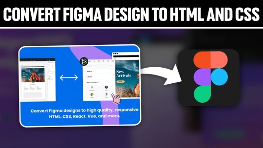
Converting Figma Designs to HTML and CSS: A Complete Tutorial
Introduction
Welcome to our comprehensive tutorial on converting Figma designs to HTML and CSS. In today's web development landscape, the seamless integration between design tools and the coding process is crucial for creating visually stunning and functional websites. This tutorial aims to guide you through the process of translating your Figma designs into clean, responsive, and optimized HTML and CSS code.
Understanding Figma Designs
Figma stands as a powerful collaborative interface design tool, empowering designers to create visually compelling and interactive user interfaces. Before diving into the conversion process, it's essential to grasp the intricacies of Figma designs and their significance in the web development workflow. Figma Features: - Vector Editing: Figma allows designers to create and edit vector graphics, ensuring scalable and high-quality designs. - Collaboration: With real-time collaboration features, multiple team members can work on the same project simultaneously, fostering efficient teamwork. - Prototyping: Designers can create interactive prototypes, offering a holistic view of user flows and interactions within the application. - Component-Based Design: The use of components ensures consistency across designs, making it easier to translate into code. Understanding the structure of a Figma design is crucial for an accurate conversion to HTML and CSS. Design elements such as layers, groups, and artboards play a pivotal role in maintaining the hierarchy and visual integrity of the design when translated into code. Figma-to-Code Workflow: - Design Exploration: Designers create and iterate on the user interface, defining styles, layouts, and interactions within Figma. - Export Assets: Export design assets such as images, icons, and SVGs for use in the HTML and CSS files. - HTML Structure: Translate the visual layout into a well-structured HTML document, ensuring a logical and semantic flow of content. - CSS Styling: Apply styles to HTML elements based on the design specifications, including typography, colors, and spacing. - Responsive Design: Ensure that the design adapts seamlessly to different screen sizes, considering mobile and desktop layouts. Developers must pay attention to the details within Figma designs, from font choices to spacing and color schemes, to faithfully recreate the designer's vision in the final web product. Stay tuned as we guide you through the step-by-step process of setting up your development environment and translating these designs into code in the upcoming sections of this tutorial.
Setting Up the Development Environment
Before embarking on the journey of converting Figma designs to HTML and CSS, it's crucial to establish a well-configured development environment. This ensures a smooth and efficient workflow throughout the coding process. Here's a detailed guide on setting up your environment: 1. Choose a Code Editor: Select a code editor that suits your preferences and needs. Popular choices include Visual Studio Code, Sublime Text, and Atom. A code editor with robust features and extensions can significantly enhance your productivity. 2. Version Control: Implement version control using Git to track changes and collaborate seamlessly. Platforms like GitHub or GitLab provide hosting solutions for your code repositories, facilitating teamwork and code management. 3. Project Structure: Organize your project structure thoughtfully. Create folders for assets, stylesheets, scripts, and HTML files. This ensures a clean and maintainable codebase, making it easier to locate and update specific elements. 4. Install Node.js: Node.js is essential for running various build tools and package managers. Install Node.js and npm (Node Package Manager) to manage project dependencies efficiently. This step is crucial for automating tasks and optimizing your workflow. 5. CSS Preprocessors: Consider using CSS preprocessors like Sass or Less to enhance your stylesheets with features like variables, mixins, and nesting. These preprocessors contribute to cleaner and more maintainable code. 6. Browser Developer Tools: Familiarize yourself with the developer tools available in web browsers. These tools aid in debugging, inspecting elements, and testing your website across different devices and screen sizes. 7. Responsive Design Testing: Explore tools for testing responsive designs. Platforms like BrowserStack or built-in browser tools allow you to simulate your website on various devices, ensuring a consistent and user-friendly experience. Tool Purpose Visual Studio Code Code editing and debugging Git & GitHub Version control and collaboration Node.js & npm Package management and task automation By meticulously configuring your development environment, you lay the foundation for a successful Figma-to-HTML/CSS conversion. In the next sections, we'll delve into the specifics of structuring HTML from Figma and styling with CSS, bringing your designs to life on the web.
Structuring HTML from Figma
Once your development environment is set up, the next crucial step in converting Figma designs to HTML and CSS is to create a well-structured HTML document. Proper HTML structuring not only ensures a logical flow of content but also lays the groundwork for seamless styling and responsiveness. Let's dive into the details: 1. Analyzing the Design: Thoroughly examine your Figma design to identify key sections and components. Create a mental map of the layout, including header, main content, sidebar, and footer. This analysis guides the HTML structure you'll implement. 2. Semantic HTML Elements: Embrace semantic HTML elements to convey the meaning of your content. Use , , , , , , and to represent different parts of your webpage. 3. Dividing Into Components: Identify design components that can be treated as separate entities. Convert these into reusable HTML components, making your code modular and easy to maintain. Utilize classes and IDs for styling and JavaScript interactions. 4. Navigation and Links: Implement navigation elements using the appropriate HTML tags. Use for the navigation bar and for links. Ensure proper linking between pages and sections of your website. 5. Form Elements: If your design includes forms, structure them using HTML form elements. Utilize , , , and other form-related tags to create a user-friendly and accessible form structure. HTML Structure Example: HTML Element Purpose Top section containing the site's logo and navigation. Main content area, housing articles, sections, and other content. Side section, often used for related content or advertisements. Bottom section with copyright information and additional links. Optimizing for Accessibility: Consider accessibility by incorporating proper heading structures (
,
, etc.), alt attributes for images, and other accessibility best practices to ensure your website is inclusive and user-friendly. By carefully structuring your HTML based on the Figma design, you set the stage for a seamless transition to CSS styling. In the upcoming sections, we'll explore the intricacies of styling with CSS, ensuring your web pages look as visually appealing as the original design.
Styling with CSS
With the HTML structure in place, the next pivotal step in converting Figma designs to a functional website is styling with CSS. CSS brings your design to life by defining the visual presentation and layout. Let's delve into the details of effectively styling your HTML elements: 1. External Stylesheets: Organize your styles by using external stylesheets. Create a separate CSS file and link it to your HTML document. This separation enhances maintainability and allows for a cleaner project structure. 2. Selectors and Properties: Utilize CSS selectors to target specific HTML elements and apply styles. Common properties include color, font-size, margin, padding, and more. Use meaningful class and ID names for clarity. 3. Typography: Define font styles for headings, paragraphs, and other text elements. Specify font families, sizes, and weights to achieve a consistent and visually appealing typography throughout your website. 4. Colors and Backgrounds: Implement the color scheme from your Figma design using CSS. Use hexadecimal or RGB values to set colors for text, backgrounds, borders, and other elements. Consider gradients and images for background styles. 5. Box Model: Understand and apply the box model to control the spacing and layout of elements. Adjust margins, padding, and borders to achieve the desired visual hierarchy and spacing between elements. 6. Flexbox and Grid: Embrace Flexbox and Grid layout models for efficient and responsive designs. These CSS features simplify the positioning and alignment of elements, ensuring a flexible and dynamic layout on different screen sizes. 7. Media Queries: Implement media queries to create responsive designs. Define breakpoints where the layout or styling should adapt to different screen sizes. This ensures a seamless user experience on both desktop and mobile devices. CSS Property Purpose color Defines the text color. font-size Sets the size of the font. margin Specifies the outside spacing of an element. padding Determines the inside spacing of an element. Testing and Debugging: Regularly test your styles across different browsers to ensure consistency. Use browser developer tools to inspect and debug your CSS code, addressing any layout or styling issues that may arise. By mastering the art of styling with CSS, you bring your Figma design to life on the web. The next section will guide you through handling interactivity and dynamic elements, enhancing the user experience of your website.
Handling Interactivity and Dynamic Elements
As we progress in converting Figma designs to HTML and CSS, it's essential to introduce interactivity and dynamic elements to create a more engaging user experience. This section focuses on incorporating JavaScript and other techniques to breathe life into your web pages: 1. JavaScript Integration: Integrate JavaScript into your project to add interactivity. Utilize event listeners to respond to user actions such as clicks, mouseovers, and form submissions. JavaScript enables you to manipulate the DOM (Document Object Model) dynamically. 2. Animation Effects: Enhance user engagement by incorporating animation effects. CSS animations and transitions can be used for subtle enhancements, while JavaScript libraries like GreenSock Animation Platform (GSAP) provide advanced animation capabilities for more complex scenarios. 3. Form Validation: Implement client-side form validation using JavaScript to enhance user experience and reduce server load. Validate user inputs for correctness before submitting the form, providing real-time feedback to users. 4. Dynamic Content Loading: Load content dynamically to improve page load times. Use JavaScript to fetch data from external sources and update specific sections of your page without requiring a full page reload. This technique enhances the perceived performance of your website. 5. Interactive Components: Create interactive components based on Figma designs. Convert buttons, sliders, modals, and other elements into interactive components using a combination of HTML, CSS, and JavaScript. Ensure a seamless transition between states for a polished user experience. Technique Purpose Event Listeners Respond to user actions like clicks and key presses. CSS Animations Create visually appealing animation effects. Form Validation Ensure accurate and validated user input. Dynamic Content Loading Improve page load times by loading content on demand. Accessibility Considerations: When adding interactivity, ensure your website remains accessible. Provide alternative text for dynamic content, focus states for interactive elements, and consider keyboard navigation for users who rely on assistive technologies. Testing Across Browsers: Thoroughly test the interactivity and dynamic elements across different browsers to ensure a consistent experience for all users. Address any compatibility issues that may arise during testing. By mastering the handling of interactivity and dynamic elements, your website moves beyond static design, offering users a dynamic and engaging online experience. The final section will cover optimizing your Figma-to-HTML/CSS project for performance, ensuring a fast and responsive web presence.
Optimizing for Performance
As we near the completion of our Figma-to-HTML/CSS journey, optimizing your project for performance is crucial to ensure a fast and responsive web presence. Efficient optimization practices not only enhance user experience but also contribute to better search engine rankings. Let's explore key strategies for optimizing performance: 1. Minification: Minify your HTML, CSS, and JavaScript files to reduce their size. Minification involves removing unnecessary whitespace, comments, and unused code, resulting in smaller file sizes and faster loading times for your web pages. 2. Image Optimization: Optimize images to strike a balance between quality and file size. Use image compression tools to reduce the size of images without compromising visual integrity. Consider using responsive images to deliver different sizes based on the user's device and screen resolution. 3. Lazy Loading: Implement lazy loading for images and other non-essential resources. Lazy loading defers the loading of certain elements until they are about to come into the user's viewport. This technique improves initial page load times, especially for content-heavy websites. 4. Content Delivery Network (CDN): Utilize a Content Delivery Network to distribute your static assets across servers worldwide. CDN ensures that users can access resources from servers geographically closer to them, reducing latency and accelerating content delivery. 5. Browser Caching: Leverage browser caching to store static files on the user's device. Cached files can be reused for subsequent visits, reducing the need to download them again. Set appropriate expiration dates for cacheable resources. Optimization Technique Purpose Minification Reduce file sizes by removing unnecessary characters and whitespace. Image Optimization Balance image quality and file size for faster loading times. Lazy Loading Defer the loading of non-essential resources until they are needed. CDN Accelerate content delivery by distributing assets across global servers. Performance Monitoring: Regularly monitor your website's performance using tools like Google PageSpeed Insights or Lighthouse. These tools provide insights into areas that need improvement, helping you fine-tune your optimization strategies. Mobile Optimization: Optimize your website for mobile devices by implementing responsive design practices. Test your website on various mobile devices to ensure a seamless and fast user experience for mobile users. By implementing these optimization strategies, you'll not only enhance the performance of your Figma-to-HTML/CSS project but also provide users with a faster and more enjoyable browsing experience. In conclusion, let's summarize the key takeaways from our tutorial.
Common Challenges and Solutions
While converting Figma designs to HTML and CSS is a rewarding process, developers often encounter common challenges. Addressing these challenges proactively ensures a smoother workflow and a successful translation of design to code. Let's explore these challenges and their solutions: 1. Design-to-Code Consistency: Challenge: Maintaining consistency between the Figma design and the coded website can be challenging, leading to discrepancies in layout, spacing, and styling. Solution: Create a style guide based on the Figma design to establish a reference for fonts, colors, and spacing. Regularly compare the coded elements with the Figma design to ensure consistency. 2. Responsive Design Complexity: Challenge: Adapting the design to different screen sizes and resolutions can be complex, especially when dealing with intricate layouts. Solution: Implement a mobile-first approach and use CSS media queries to progressively enhance the design for larger screens. Test thoroughly across various devices to identify and address responsiveness issues. 3. Browser Compatibility: Challenge: Different browsers may interpret CSS and JavaScript differently, leading to compatibility issues. Solution: Test your website on multiple browsers and versions, addressing any inconsistencies. Utilize browser prefixes for CSS properties and consider using feature detection libraries to handle browser-specific quirks. 4. Performance Bottlenecks: Challenge: Performance issues, such as slow loading times and unoptimized assets, can impact the user experience negatively. Solution: Employ optimization techniques discussed earlier, including minification, image optimization, lazy loading, and content delivery networks (CDN). Regularly monitor and analyze your website's performance to identify and resolve bottlenecks. Challenge Solution Design-to-Code Consistency Create a style guide and regularly compare coded elements with the Figma design. Read the full article
0 notes
Text
How to Export Figma to HTML Code: Step-by-Step Guide
In the world of web design and development, efficiency is key. One tool that has revolutionized the design process is Figma, a cloud-based design platform that allows teams to collaborate in real-time. However, once the design phase is complete, the next step is to convert those stunning visuals into functional code. This is where knowing how to export Figma to HTML comes into play.
Understanding the Figma to HTML Process
Figma to HTML is the bridge that transforms your design files into a web-ready format. This process involves translating the visual elements, such as images, text, and layouts, into HTML code that browsers can understand and render as a website.
Step 1: Organize Your Figma Design
Before exporting to HTML, it's essential to have a well-organized Figma design. Ensure that all layers are named appropriately, and elements are grouped logically. This will make the conversion process much smoother.
Step 2: Export Assets
Start by exporting any images, icons, or other assets used in your design. Figma provides an easy-to-use export feature that allows you to select and save individual elements as PNGs, SVGs, or other common image formats. Remember to keep track of where you save these files, as you'll need to reference them later.
Step 3: Use a Figma to HTML Converter
There are several tools available online that specialize in converting Figma designs to HTML code. These converters streamline the process, saving time and ensuring accuracy. Simply upload your Figma file, and the converter will generate the corresponding HTML code.
Figma to HTML converters are equipped to handle various design elements, from basic shapes and text to more complex features like gradients and shadows. This ensures that your design is faithfully translated into code.
Step 4: Review and Adjust
Once you have the initial HTML code, it's crucial to review the output. Check for any discrepancies between the design and the generated code. This could include spacing issues, font styles, or any other visual elements that may need adjustment.
Step 5: Add Interactivity with CSS and JavaScript
While the Figma to HTML converter does an excellent job of translating the visual elements, you may need to add interactivity using CSS and JavaScript. This includes animations, transitions, and responsive design elements that enhance the user experience.
Step 6: Test Across Browsers and Devices
Before finalizing your HTML code, it's essential to test it across different browsers and devices to ensure compatibility. This step helps identify any potential issues that may arise when the website is live.
Step 7: Optimize for Performance
Optimizing your HTML code is crucial for ensuring fast load times and a seamless user experience. This involves minimizing unnecessary code, compressing images, and utilizing techniques like lazy loading to prioritize content.
Step 8: Deploy Your Website
With your HTML code ready and optimized, it's time to deploy your website to a hosting platform. Choose a reliable hosting provider that offers the resources and support you need to keep your site running smoothly.
Conclusion
Knowing how to export Figma to HTML opens up a world of possibilities for designers and developers alike. It streamlines the transition from design to code, saving time and ensuring a seamless user experience. By following these steps, you can confidently convert your Figma designs into functional, web-ready HTML code. Embrace the power of Figma to HTML conversion and elevate your web design projects to new heights.
0 notes
Text
What are some best practices for converting Figma designs to HTML?
Converting Figma designs to HTML can be a seamless process with the right approach. Here are some best practices to ensure an effective transition from Figma to HTML:
Prepare Your Design: Before you start coding, ensure your Figma design is clean and well-organized. Use proper layers, naming conventions, and components to make the conversion easier.
Export Assets: Export all necessary assets (images, icons, etc.) from Figma in the appropriate formats. SVGs are great for icons and logos, while PNGs or JPEGs are better for detailed images.
Use a Style Guide: Implement a style guide or design system. Ensure you capture all the typography, color schemes, and spacing in your CSS to maintain design consistency.
Responsive Design: Ensure your HTML and CSS code is responsive. Use media queries to adapt your design for different screen sizes and devices, reflecting the responsive design principles used in Figma.
HTML Structure: Build a semantic HTML structure based on your Figma layout. Use proper HTML5 elements like <header>, <nav>, <main>, and <footer> to enhance accessibility and SEO.
CSS Grid and Flexbox: Utilize CSS Grid and Flexbox to replicate complex layouts and alignments from Figma. These modern layout techniques will help you achieve the design as closely as possible.
Test Across Browsers: Test your HTML output across different browsers and devices to ensure cross-browser compatibility and fix any inconsistencies that arise.
Iterate and Refine: Compare your HTML output with the Figma design and make necessary adjustments. Iteration is key to ensuring the final result matches the design closely.
By following these best practices, you can effectively convert your Figma designs to HTML while maintaining design integrity and functionality.
0 notes